
Logos can be found all over the place. We’re swamped by advertising on the clothes we wear, the smartphones we use, and the meals we buy. Some logos are simple, such as a letterform or a visual depiction, while others are more complicated. But there’s no denying that a logo’s meaning communicates to the audience what your company is all about. We can tell which brand it is only by looking at the logo. That is the power of a logo; it has the ability to build or break a brand. Designing a good logo isn’t easy, yet all of the major brands have one thing in common: remarkable logos! Almost every well-known company has a backstory and a fascinating tale about how the logo was created by the designers and marketers.
Many of us don’t give a second thought to what these logos symbolise other than the fact that they are associated with some of our favourite brands. But we don’t realise that many of them have a deeper meaning or interesting facts hidden within or beyond the iconic symbol, which we’ll explore in this article. Here are the 10 most famous brand logos which has hidden meaning and facts behind them.
1. FedEx
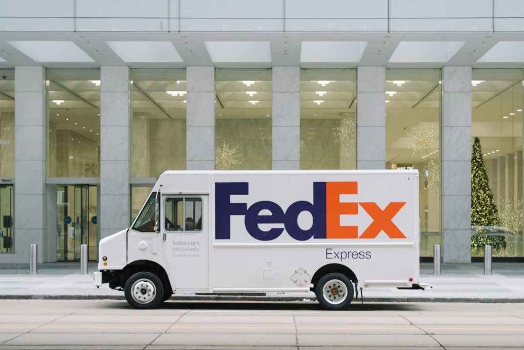
One of the most well-known logos in the world is that of FedEx. The logo’s bold typography and brilliant colours, however, are not what makes it great. The FedEx logo features a concealed white arrow between the letters “E” and “x” that was made by combining two different fonts and is a great example of negative space. The design is both simple and straightforward. It has received more than 40 design accolades and is known for its innovative use of negative space.
While tinkering with the letters, the designer noticed a little arrow appear between the letters E and x. To make the arrow look natural and unforced, he had to combine the best features of two separate fonts. When FedEx saw a handful of the final ideas, the CEO was the first to find the concealed arrow in Lindon’s design, which everyone adored.
2. Apple
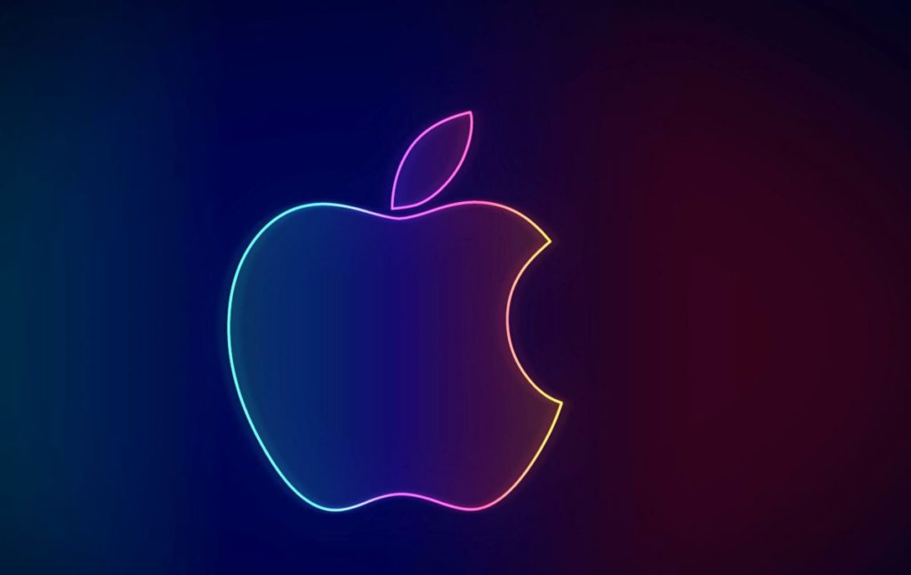
Sir Isaac Newton is illustrated under an apple tree in Apple’s original logo, created by Ron Wayne. Rob Janoff drew a rainbow apple to update that logo pretty quickly. The coloured stripes were added to make the logo more visible and to show that the Apple II could produce coloured visuals. Subsequently, the company switched to a monochrome logo since it gives them more options when branding their products. According to legend, the Apple logo was created in honour of Alan Turing, who committed suicide by biting into a poisonous apple. In truth, designer Rob Janoff claims that he created the bitten apple to highlight its features because a whole apple can be easily mistaken with any other similar fruit, such as a cherry.
3. VLC Media Player
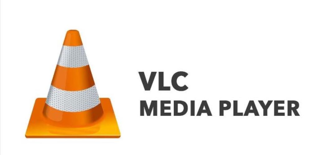
We’ve all pondered what the VLC Media Player’s traffic cone represents at some time in our lives. Finally, you can put all of your assumptions to rest! The ViaRézo Association of the École Centrale’s Networking Students’ Association is the inventor of the VLC Media Player. Some of the organisation’s members once returned home drunk carrying a traffic cone. They began collecting cones after that. The cone was chosen as the logo for the VideoLAN project when they started developing the VLC Media Player.
4. Domino’s Pizza
DomiNick’s, a small pizza shop operated by two brothers, was the precursor to Domino’s. The younger brother altered the name from DomiNick’s to Domino’s. Because there were only three original Domino’s outlets in 1965, the logo for Domino’s Pizza features three dots. In addition, he intended to incorporate one dot for each new store he added to the chain. However, the company grew so quickly that he had no choice but to abandon the plan. If they’d kept on with the plan, the logo would now have almost 13,000 dots!
5. Lacoste
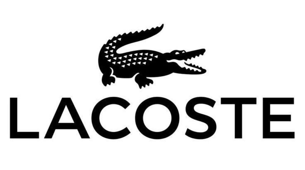
René Lacoste and his team captain, Alan Moore, were walking down the street in 1923 when they discovered a crocodile skin bag in one of the shop fronts. Alan and René made a bet that Alan would purchase René the bag if he wins the next match, according to Lacoste and Moore. Lacoste lost, but the incident caught the attention of a journalist, who published an article about a tennis player who didn’t win but ended up fighting like a crocodile. That’s how Lacoste acquired his nickname, and his brand later adopted the reptile’s logo.
6. Nike
One of the most well-known logos in the world is also one of the most affordable. Phil Knight, the brand‘s owner, paid student Carolyn Davidson $35 for her job in 1971, and he wasn’t thrilled with the results initially. He was proven to be completely wrong; the swoosh logo was a huge hit, and it’s no shock that it’s commonly synonymous with Nike, the goddess of triumph and victory.
7. Walt Disney
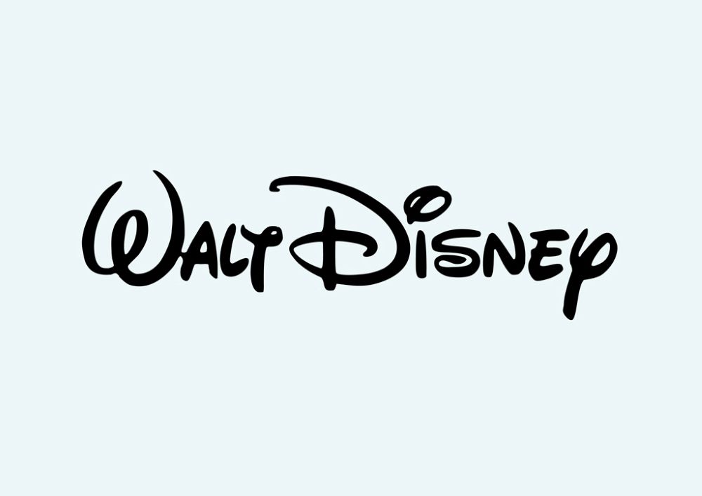
The Walt Disney logo is instantly recognisable by people of all ages all around the world. “Walt Disney Presents” was all that was on the initial logo. The castle’s picture was inserted afterwards. But that’s not the most fascinating aspect. The majority of people believe the autograph on the logo is that of Walt Disney’s. However, this is not the truth. It is, in fact, modelled on a version of it created by a Walt Disney employee who used to address fan mails on his behalf. Walt Disney had trouble signing his own autographs because of how popular the stylised version got.
8. Amazon
When it comes to online shopping, Amazon is a force to be reckoned with, and its logo reflects this. Their logo’s yellow arrow begins with the letter ‘a’ and ends at the word ‘z,’ signifying that they supply just about anything from a to z. The arrowhead is a stylised dimple or grin line, while the arrow indicates a smile. The smile represents the joy that consumers get when they shop on Amazon.
9. Ferrari
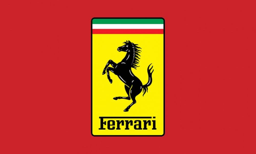
Many people believe that the Ferrari logo represents horsepower, but that’s not the case. The horse figure was first painted on the aircraft of Italian ace pilot Francesco Baracca, according to Enzo Ferrari’s biography. After Enzo’s success in a race, Francesco’s mother presented him with the symbol, which later became a well-known trademark that the brand is identified with.
10. Toblerone
Toblerone is a well-known chocolate bar that has been around for a long time. Its present logo depicts a mountain, which represents the Matterhorn Mountain in Switzerland. A bear is concealed within the mountain, symbolising the chocolate’s special honey flavour and the fact that it is produced in the ‘City of Bears.’